Did you know 38% of users keep subtitles on while watching TV? This highlights the importance of readable text for all video content, especially YouTube Shorts.
In this blog post, I’ll share the best fonts for YouTube Shorts to keep your audience engaged.
These fonts offer a mix of boldness, readability, and modern style, chosen for their popularity and ease of use. Ready to make your Shorts stand out? Let’s dive in!
Table of Contents
1. Montserrat Extra Bold
Montserrat is a powerful sans-serif (without decorative “feet”) typeface inspired by vintage city posters. Its clean lines and geometric shapes offer a modern vibe.
The Extra Bold version is fantastic for grabbing attention with its thick, strong lettering. It’s ideal for titles and call-to-action text.
You’ll see Montserrat frequently on influencer channels like Alex Hormozi’s – it helps convey a sense of boldness and importance.
There’s another font out there called “The Bold Font” that has a similar look to Montserrat Extra Bold.
It’s also a thick, chunky sans-serif font that can be a good choice for grabbing attention.
However, Montserrat Extra Bold is the more popular option and offers a wider range of weights (light, regular, bold, etc.) that you can use for a more consistent look across your YouTube Shorts.
2. Roboto
Developed by Google, Roboto is one of the most popular fonts in the world, and for good reason. Designed for clarity and ease of reading, it exudes a friendly yet professional vibe.

Roboto’s clean, geometric design feels modern without being overly trendy. It’s a safe choice for virtually any type of YouTube Shorts content, making it incredibly versatile.
Why is Roboto so popular?
- Readability: Roboto was built specifically for screens, meaning it looks crisp and easy to read even at small sizes. This is crucial for YouTube Shorts, where viewers need to grasp information quickly.
- Adaptability: Roboto offers a full range of weights, from thin and light to bold and black. Use the lighter weights for subtitles or longer text, and the heavier weights for attention-grabbing titles that pop.
- Google’s Choice: Because Roboto is the default Android font, it has a certain familiarity without feeling overused. It provides a polished and reliable look.
Roboto in Action
You’ll find Roboto (or its variation, Roboto Condensed) across countless YouTube channels, as it adapts to both informational and lighthearted content equally well.
Its versatility makes it a favorite for everything from tech reviews to cooking tutorials to vlogs.
Things to Consider
While its widespread use is a testament to its quality, Roboto may not be the most exciting choice if you aim for a unique and stand-out style.
If your goal is differentiation, explore bolder or more decorative fonts to create a strong brand identity.
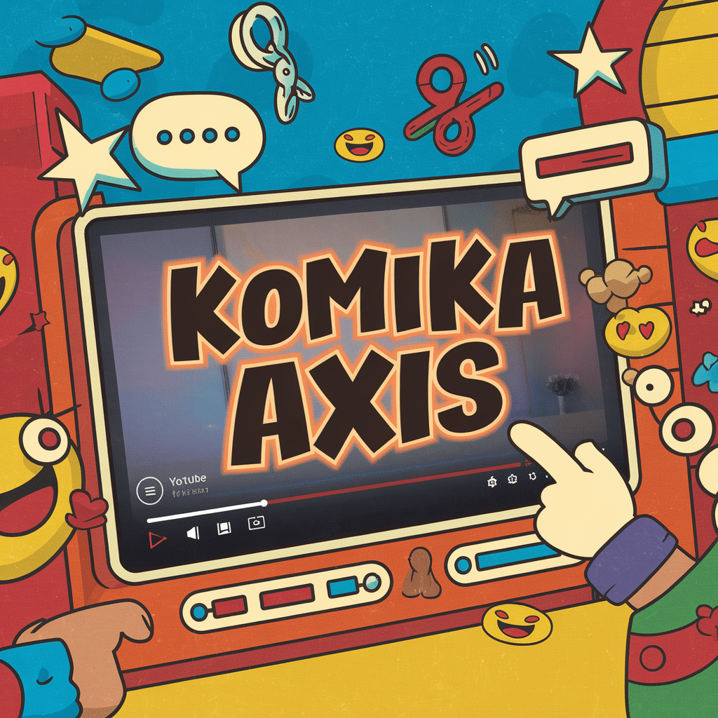
3. Komika
Komika is a hand-drawn style font with a dash of comic book flair, injecting a sense of energy and lightheartedness into your YouTube Shorts.
Its slightly uneven letters and rounded corners exude a friendly, approachable vibe, making it a great choice for creators with a playful and down-to-earth persona.
Komika’s Claim to Fame
Want to channel the energy of one of YouTube’s biggest stars? Komika is frequently used by Mr. Beast in his wildly popular Shorts and videos. If you aim for that mix of high-energy and humor, Komika is a fantastic fit.
Why choose Komika?
- Eye-catching: Komika’s bold, somewhat chunky style immediately demands attention, perfect for titles or on-screen text.
- Commercial-friendly: Komika is a free font, and you can even use it for commercial projects (like monetized videos) without worrying about licensing. This makes it a budget-friendly and hassle-free option.
- Great for entertainment: If your Shorts focus on humor, challenges, pranks, or “out there” content, Komika aligns perfectly with this playful energy.
Komika in Action
Besides Mr. Beast’s channel, you’ll see Komika used by YouTubers who aim for a lighthearted and relatable style.
It’s particularly well-suited to Shorts with a focus on entertainment and pop culture.
A Note on Versatility
While fantastic for fun content, Komika may not be the ideal choice if you create serious, educational, or professional-style Shorts. Its unique character could clash with the tone of that content.
4. Helvetica
Helvetica is one of the most famous and widely used fonts in the world. Its clean lines, neutral appearance, and exceptional readability have made it a staple in graphic design for decades.
Helvetica exudes a sense of professionalism and timelessness, lending a touch of sophistication to your YouTube Shorts titles and overlays.
Why is Helvetica so enduring?
- Supreme readability: Helvetica’s simple shapes and even spacing make it easy on the eyes, even in short bursts. This is key for Shorts, where viewers need to grasp text quickly.
- Unparalleled versatility: Helvetica somehow feels both modern and timeless. It works just as well for a tech company’s product demos as it does for a lifestyle blogger’s Shorts on morning routines.
- Prestige and familiarity: Helvetica was heavily used by Apple for years, contributing to its association with sleek and high-quality design.
Helvetica in Use
You’ll spot Helvetica across various brands and industries. Its clean aesthetic makes it popular for logos, signage, and professional materials. In the YouTube space, Helvetica conveys a modern feel without being overly trendy, making it a good choice if you want a polished appearance.
The Catch
There’s one major downside to Helvetica: it’s not free. While it’s often pirated, strictly speaking, you need a license for commercial use (which monetized YouTube Shorts fall under). If you want a free alternative with a similar feel, try exploring “Arial” (a very close cousin) or open-source fonts like Montserrat.
5. Poppins
Poppins is a geometric sans-serif typeface with a warm and inviting touch. Its clean lines and rounded shapes give it a contemporary feel without appearing cold or sterile.
This makes Poppins a versatile choice suitable for a wide range of YouTube Shorts content.
Why Poppins Works
- Readability: Poppins is designed to be legible even at smaller sizes, making it a safe choice for subtitles or secondary text on your Shorts.
- Adaptability: With its array of weights (from thin to bold), Poppins can fill various roles. Thinner weights work for more extended text, while thicker versions can grab attention in titles.
- Approachability: While still clean and modern, Poppins has just a touch of softness that makes it feel friendly and welcoming. This can be an advantage if you create content that’s relatable and casual.
See Poppins in Action
Poppins is an incredibly common sight across YouTube channels. You’ll often see it used for subtitles, informational text overlays, or even channel branding elements. Its adaptability makes it a solid choice if you want a reliable “workhorse” font
Ali abdaal uses this font for his shorts.
Keep in Mind
Due to its widespread popularity, Poppins alone might not make your Shorts stand out. If you’re aiming for a really unique look, try pairing it with a bolder or more decorative display font for a touch of contrast.pen_spark
6. Raleway
Raleway is a highly versatile sans-serif font that exudes a sense of elegance and refinement.
Initially designed as a single thin weight, it has been expanded into a full family, offering various styles to suit your needs.
Raleway offers a clean, contemporary look with a subtle touch of sophistication, making it well-suited for a range of YouTube Shorts content.
Why Choose Raleway?
- Elegance and clarity: Raleway’s well-balanced letterforms and clean lines make it easy to read while also adding a touch of refinement to your titles or overlays.
- Versatility: With a wide range of weights, from thin to bold, Raleway can be adapted to various roles. Thinner weights are excellent for subheadings and text overlays, while bolder versions can make impactful titles.
- Modern feel: Raleway’s overall design gives it a contemporary edge without feeling overly trendy or futuristic, making it well-suited for modern content.
Raleway in Action
You’ll find Raleway employed by creators who aim for a clean and uncluttered aesthetic.
It’s often used by channels focusing on design, minimalist living, or high-end products. However, its adaptability makes it suitable for a broad range of content if you want a polished and sophisticated touch.
Keep in Mind
Raleway’s elegance may not be ideal for highly playful or quirky Shorts where a more lighthearted font might be a better fit. Consider pairing it with a bolder or more decorative display font for a touch of contrast if you want something truly eye-catching.
7. Opinion Extra Bold
Opinion Extra Bold is a geometric sans-serif font with a powerful presence. Its thick, bold strokes and sharp corners demand attention, making it ideal for YouTube Shorts that need to grab viewers in an instant.

This font exudes confidence and authority, perfect for titles, call-to-actions, or short, impactful statements.
Standing Out from the Crowd
With its bold personality, Opinion Extra Bold isn’t for the faint of heart. It’s a great choice if you want your Shorts to have a distinct visual identity and leave a lasting impression.
Why Choose Opinion Extra Bold?
- High Impact: The thick strokes and strong presence of Opinion Extra Bold ensure your titles stand out, even in a crowded feed.
- Modern and Edgy: Its geometric design feels contemporary and slightly futuristic, perfect for tech-related content or Shorts aiming for a cutting-edge vibe.
- Readability at a Glance: Despite its boldness, Opinion Extra Bold maintains good letter spacing and clear shapes, making it readable even at small sizes on mobile devices.
Who Uses Opinion Extra Bold?
This font isn’t as widely used as some on this list, but that can be an advantage if you’re aiming for a unique look. You might find it used by creators in the tech review space, those focusing on bold fashion or makeup tutorials, or channels with a strong, opinionated voice.
Things to Consider
Since it’s such a bold statement, Opinion Extra Bold might overpower other design elements in your Shorts. Use it sparingly for maximum impact, and pair it with a simpler, lighter weight font for subtitles or additional text.
8. Mont Heavy
Mont Heavy is a geometric sans-serif typeface with a commanding presence. It’s one of the heaviest weights in the versatile Mont font family. Its thick strokes, broad shapes, and slightly condensed style make it eye-catching and memorable.

Mont Heavy offers a touch of vintage charm with its retro vibe, making it a unique choice for Shorts creators looking to evoke a bit of nostalgia.
Why Choose Mont Heavy?
- Attention-grabbing: Mont Heavy’s bold design is ideal for titles that need to stand out from the crowd. Its weight makes sure those titles pack a punch.
- Vintage Flair There’s a subtle retro feel to Mont Heavy, reminiscent of old-school posters and signage. This can be a fantastic asset if you create content with a nostalgic edge or want to channel a bit of mid-century charm.
- Strong and Reliable: Mont Heavy exudes a sense of sturdiness and reliability, aligning well with factual or authoritative content.
Mont Heavy in the Wild
You’ll spot Mont Heavy in Shorts or videos where a vintage aesthetic is desired or where titles need a bold, commanding feel. It’s a good choice for history channels, creators who review retro products, or lifestyle Shorts that aim for a classic, timeless look.
Keep in Mind
While Mont Heavy is incredibly eye-catching, it’s important to use it with some restraint. Its boldness could become overwhelming if used for all your text elements. Try pairing it with lighter fonts from the Mont family for balance.
9. Titan One
Titan One is an ultra-bold display font designed to make a dramatic statement. With its incredibly thick strokes and exaggerated proportions, it demands attention and leaves a lasting impression.

If you want to create YouTube Shorts titles that can’t be missed, Titan One is an excellent contender.
Why Choose Titan One?
- Boldness Personified: Titan One is the definition of a bold typeface, making it the perfect choice for power words, short headlines, and attention-grabbing calls to action.
- Energetic and Playful: While incredibly bold, Titan One has a touch of whimsy in its design, making it suitable for fun and lighthearted content as well as serious and authoritative topics.
- Trendy Yet Distinctive: Titan One has been increasingly popular in recent years, making it feel modern and fresh. However, its unique proportions help it stand out from other ultra-bold choices.
See Titan One in Action
You might find Titan One used by creators focusing on high-energy content, channels aimed at young audiences, or Shorts promoting special offers or announcements. Its ability to convey both excitement and importance lends itself to a wide range of content.
A Note on Versatility
While it can be used skillfully in a variety of Shorts, Titan One might not be the best choice for extended amounts of text.
It’s primarily a title and display font. Always pair it with a more legible typeface for subtitles or additional text.
10. Luckiest Guy
Luckiest Guy is a hand-drawn, all-caps font with a playful and approachable vibe. Its slightly uneven letters and quirky style bring a touch of personality and charm to your YouTube Shorts titles or overlays.

This font conveys a laid-back, relatable quality, which makes it a great fit for creators with down-to-earth or humorous personalities.
Why use Luckiest Guy?
- Approachability: Luckiest Guy feels like the handwriting of a friendly person, making your text instantly more inviting and accessible.
- Fun and Personal: This font injects a bit of lighthearted fun, perfect for vlog-style Shorts, hobby-related content, or creative DIY channels.
- Unique Touch: Hand-drawn fonts like Luckiest Guy stand out from the often-used geometric sans-serif or formal serif choices, adding a unique touch to your Shorts.
See Luckiest Guy in the Wild
You’ll spot Luckiest Guy on lifestyle channels, creative vlogs, or Shorts from creators who aim for a relatable, “best friend” vibe. It’s also a popular choice for small businesses whose branding centers around a friendly, personal feel.
Keep in Mind
Luckiest Guy, being all-caps, isn’t the most readable for longer blocks of text. It shines for titles, short phrases, and overlays. Pair it with a clean sans-serif font for any additional text you need to include.
11. Barlow
Barlow is a sans-serif typeface inspired by the “grotesque” fonts from the early 20th century. Designed with web readability in mind, it offers a clean, modern look with a hint of warmth.

This subtle friendliness gives it a slight edge over some other ultra-clean sans-serif fonts. Barlow feels professional without being cold, making it adaptable to a wide range of YouTube Shorts content.
Why Choose Barlow?
- Legibility: Barlow’s well-spaced, even letterforms make it easy to read on screen, even at smaller sizes. This is essential for subtitles or informative text overlays.
- Versatility: With its range of weights and styles, Barlow functions well for various roles in your Shorts. Use lighter weights for extended text and bolder weights for impactful titles.
- Modern Touch: Barlow’s overall design gives it a contemporary feel without appearing overly trendy. This makes it suitable for tech-related channels, educational content, or creators who want a polished yet approachable look.
Barlow in Action
Because of its versatility, you’ll see Barlow pop up across a wide variety of channels. It’s often used for subtitles, informational overlays, and branding elements where clear readability is essential.
Keep in Mind
Barlow’s popularity means that it might not be the best choice if you’re aiming for an extremely distinctive visual style. However, its adaptability makes it a solid “workhorse” font to have in your toolkit.
Final Words
The perfect font for your YouTube Shorts isn’t just about what looks good – it’s about connecting with your viewers on a deeper level. Think about the mood you want to convey, the audience you aim to reach, and the overall aesthetic of your channel.
Do you want something bold or playful? Professional or retro? With the wide variety of fonts available, there’s sure to be one that helps your content shine.
Don’t be afraid to experiment! Try out different fonts for thumbnails and titles, paying attention to how they make you feel.
Does the font match your message and give the right impression? Finding the right fonts might take some trial and error, but the payoff is worth it. A font can completely change the energy of your Shorts and help your content reach its full potential.
Need More Inspiration?
If you’re still feeling stuck, be sure to explore popular YouTube channels within your niche and see what kind of fonts they use. Draw inspiration, but don’t be afraid to try something unique to help your Shorts stand out in a crowded space