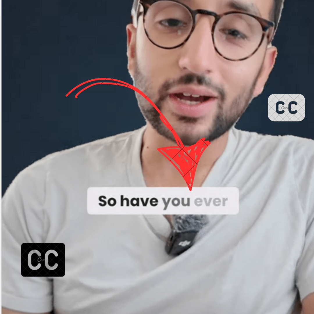
Subtitles are proven ways to increase engagement for your videos. Subtitle font can definitely impact the engagement of subtitles.
In this post blog, you will find out the best YouTube subtitle font. These fonts are collected by analyzing thousands of YouTubers.
Listen Monster is a free tool to generate subtitles. You can export results in srt and txt format.
To burn subtitles over the video you can use a video editor. You can also directly upload subtitles to YouTube. It will use a closed caption for the user. The main disadvantage is that there is no way to select a font family.
While add subtitles over the video by video editor you can choose the font family.
Best Youtube Subtitle Fonts
1. Bebas Neue
The first recommended font for YouTube subtitles is Bebas Neue. This sans serif typeface was designed in 2005 by Dharma Type. Bebas Neue features a bold, high-contrast design that is optimized for readability at small sizes.
The sturdy letterforms stand out clearly against video backgrounds without becoming visually overpowering. With its condensed letter spacing, Bebas Neue allows more text to fit into the limited space of subtitles.
The geometric shapes and neat, unambiguous styling make each letter instantly recognizable. Overall, Bebas Neue is an excellent choice for subtitle legibility.
2. Impact
Another top pick for YouTube subtitles is Impact. Designed in 1965 by Geoffrey Lee, this sans serif typeface delivers maximum legibility thanks to its tall x-height and wide letterforms. The high contrast between thick and thin strokes also boosts clarity.
Impact’s distinctive stacked, slab-serif appearance has an industrial vibe that pairs well with many video styles. The all-caps lettering evokes a bold, straightforward tone.
Generous spacing between letters prevents words from blurring together during playback. With its retro aesthetics and uncompromising readability, Impact is a go-to font choice for subtitles that need to command attention.
3. Helvetica
The classic Helvetica font is also an excellent choice for YouTube subtitles. Designed in 1957 by Max Miedinger, this ubiquitous sans serif typeface is known for its clarity and simplicity.
The well-balanced letterforms and medium weight make Helvetica subtitles easy to read at a glance.
The modest letter spacing and proportions fit more text into the limited screen space. Helvetica’s restrained, neutral appearance doesn’t overpower or distract from the video visuals. This versatile font complements a wide range of content from corporate to creative.
Overall, Helvetica is a reliable subtitle font that provides readability without flair. It gets the job done with its quiet effectiveness.
4. River Drive
Another good font for YouTube subtitles is River Drive. This font has round, friendly letters that are easy to read. It was created in 2011 by Justin Callaghan. The letters in River Drive don’t have any fancy extras. This keeps things simple.
The letters are a medium thickness, not too skinny or too fat. There is enough room between each letter to see them clearly. River Drive is a casual and fun font. It works well for many types of videos.
The readable letters help viewers understand the words without distraction. River Drive is a great subtitle font choice for clarity and character.
5. Dustin Font
Dustin is also an excellent font choice for YouTube video subtitles. Designed by DB Type Foundry, Dustin features a rounded, geometric sans-serif style. The circular shapes create a friendly and approachable vibe.
Each letterform has an open, distinguishable structure that enhances readability. Dustin subtitles will stand out clearly against busy video backdrops.
![Best Youtube Subtitle Font in [year] 1 Best font for youtube](https://listenmonster.com/blog/wp-content/uploads/2023/10/Dustin-Font-1024x681.png)
The font maintains readability at small sizes, making it ideal for on-screen text. With its soft, contemporary aesthetics, Dustin brings a modern flair to subtitles. The simplicity of the letterforms works well for a variety of content types and tones. Overall, Dustin is a versatile and engaging font that delivers readable, stylish subtitles.
6. Config Rounded
Config Rounded is an engaging, playful subtitle font designed by Gustavo Piqueira in 2012. The rounded, circular letterforms create an approachable, friendly vibe.
Config Rounded features open counters and clearly distinguishable letters that stand out against busy backdrops. This enhances legibility when viewed on-screen at small subtitle sizes.
![Best Youtube Subtitle Font in [year] 2 Font](https://listenmonster.com/blog/wp-content/uploads/2023/10/Font-1024x535.png)
The combination of thick and thin strokes also boosts clarity and visual interest. Overall, Config Rounded brings a casual, inviting personality to video subtitles. The soft, rounded shapes are easy on the eyes while maintaining a readable style.
Config Rounded offers a fun, conversational tone that provides an engaging subtitle option for a wide range of applications and video styles.
7. The bold
This font is created in 2010 by Joshua Darden, is an ideal subtitle font for commanding attention. True to its name, The Bold utilizes ultra-thick, blocky letterforms with high stroke contrast. This heavy, structured styling ensures subtitles stand out unambiguously.
The Bold enhances subtitle readability thanks to the generous spacing between bold, imposing letters. Ample counters allow letters to retain their recognizable shapes at small sizes.
With its unapologetically bold presence, The Bold makes subtitles impossible to overlook. This assertive, imposing font pairs well with serious, dramatic video content where the subtitles must grab viewer focus.
The Bold is a foolproof subtitle option when videos require subtitles that are utterly bold and interruption-proof.
8. Roboto
Roboto is designed in 2011 by Christian Robertson, brings a refined, contemporary vibe to subtitles. This popular sans serif font features gentle curves and a sleek, geometric feel. The smooth, well-balanced letterforms maintain high readability at both large and small on-screen sizes.
Subtle stroke modulation and modest proportions help prevent blurring during video playback. Roboto has a minimalist, neutral aesthetic suitable for various content types – from corporate to creative.
With its modern sensibility and versatile clarity, Roboto offers a reliable subtitle font for both professional and casual applications. The subtle curves add softness while maintaining a polished, legible style.
Roboto subtitles make a sophisticated addition to videos across genres and contexts.
9. Bevan
Bevan, created in 2011 by Flat-It, takes a playful, bouncy approach to subtitle fonts. This informal font has a handwritten, organic vibe with distorted, wavy letterforms.
Bevan adds a touch of casual flair through its curvy, irregular shaping. The friendly styling brings visual interest and personality to subtitles.
![Best Youtube Subtitle Font in [year] 3 Youtube fonts](https://listenmonster.com/blog/wp-content/uploads/2023/10/Youtube-fonts-1024x275.png)
Readability stays intact thanks to Bevan’s modest proportions and distinguishable letters. As a humorous, bubbly font, Bevan suits lighthearted videos and energetic content meant to exude fun.
The casual tone matches laid-back contexts where standard uniform fonts would feel overly stiff. Bevan subtitles lend videos a dynamic, lively attitude that grabs viewer attention with charm and readability.
Final Words
I have shared the best fonts for YouTube subtitles. In the last, it depends upon your video project.
If you think I missed an important font do let me know by the comment section. I will happy to add that font in the list.


